
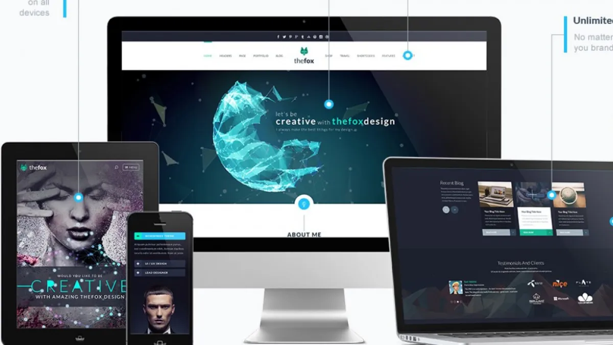
The benefits of a mobile-first website strategy
[Why prioritizing mobile users can enhance your business success]
In today’s fast-paced digital world, having a mobile-first website strategy has become increasingly important for businesses of all sizes. With more and more people accessing the internet on their mobile devices, it’s essential that your website is optimized for these smaller screens (unless you prefer a ‘phablet’ like me!). In this article, we’ll take a closer look at the benefits of a mobile-first website strategy and how it can help your business succeed in today’s competitive marketplace.
What is a mobile-first website strategy?
A mobile-first website strategy is a design and development approach that prioritizes the user experience on mobile devices. Instead of designing for desktop first and then adapting the design for smaller screens, mobile-first design starts with the mobile user in mind and then adapts the design for larger screens. This approach ensures that your website is optimized for the growing number of mobile users and provides a seamless experience across all devices.
Benefits of a mobile-first website strategy
Improved user experience
One of the primary benefits of a mobile-first website strategy is improved user experience. With a mobile-first approach, you can ensure that your website is easy to use on small screens, with clear and concise content, easy-to-navigate menus, and fast loading times. This results in a more positive user experience, which can lead to increased engagement and conversions for your business.
Better SEO performance
A mobile-first website strategy can also improve your search engine optimization (SEO) performance. Google’s algorithms prioritize mobile-friendly websites, so if your website is not optimized for mobile devices, you could be missing out on valuable search engine rankings. By optimizing your website for mobile devices, you can improve your SEO performance and increase your visibility in search engine results pages. In a nutshell, if your website isn’t mobile-first, then Google will simply de-rank you—and you don’t want that, do you?
Increased conversion rates
Mobile-first design can also improve your website’s conversion rates. By optimizing your website for mobile devices, you can provide a better user experience, which can lead to increased engagement and conversions. Additionally, mobile users are more likely to make a purchase or take a desired action on your website if it’s easy to use and navigate on their device. Makes sense, right?
Competitive advantage
In today’s digital landscape, having a mobile-first website strategy can give you a competitive advantage as your competitors haven’t (yet) jumped on the bandwagon. With more and more people accessing the internet on their mobile devices, having a website that’s optimized for mobile can help you reach a wider audience and stand out from the competition.
How to implement a mobile-first website strategy
Now that you understand the benefits of a mobile-first website strategy, it’s time to implement it for your business. Here are some steps you can take to get started:
Conduct user research
Before you start designing your mobile-first website, it’s important to conduct user research to understand your audience’s needs and preferences. This can help you design a website that’s tailored to their needs and provides the best possible user experience.
Focus on speed and performance
Mobile users expect fast loading times and smooth performance. To ensure your website meets these expectations, focus on speed and performance throughout the design and development process. This can include optimizing images, reducing the number of HTTP requests, and minimizing code.
Prioritize content
With limited screen space on mobile devices, it’s important to prioritize content that’s most important to your audience. This can include clear calls-to-action, easy-to-use menus, and concise copy that’s easy to read on small screens.
Use responsive design
Responsive design allows your website to adapt to different screen sizes, ensuring a consistent user experience across all devices. This can help you reach a wider audience and provide a seamless experience for mobile users.
Test and iterate
Once your mobile-first website is live, it’s important to test and iterate on your design to ensure it’s providing the best possible user experience. This can include user testing, performance analysis, and regular updates to keep up with changing user needs and device capabilities.
Why mobile-first strategy matters for SEO
Apart from providing a better user experience and increasing the conversion rate, a mobile-first strategy also has a positive impact on search engine optimization (SEO). Google and other search engines prioritize mobile-friendly websites in their search results, which means having a mobile-first strategy can give you an advantage in the rankings.
Furthermore, page speed is a crucial ranking factor, and mobile devices often have slower internet speeds than desktop devices. By implementing a mobile-first strategy, you can improve your website’s page speed and load times, which can positively impact your rankings and drive more organic traffic to your site.
Mobile-first indexing, which Google introduced in 2018, is another reason why a mobile-first strategy matters for SEO. Mobile-first indexing means that Google primarily uses the mobile version of a website’s content for indexing and ranking, rather than the desktop version. This means that if your website is not optimized for mobile devices, it may not rank as well in search results.
Tips for implementing a mobile-first strategy
Now that you understand the benefits of a mobile-first strategy, it’s time to implement it on your website. Here are some tips to get you started:
-
Choose a responsive design: A responsive design adapts to the size of the screen it’s being viewed on. This means that your website will look great on any device, from a desktop computer to a smartphone. Using a responsive design is the easiest and most effective way to implement a mobile-first strategy.
-
Optimize images: Images can significantly impact your website’s page load times, which is why it’s essential to optimize them for mobile devices. Use compressed images and reduce the file size as much as possible without sacrificing quality.
-
Use mobile-friendly fonts: Not all fonts are legible on mobile devices, so it’s important to choose a font that is easy to read on smaller screens. Sans-serif fonts, like Arial and Helvetica, are typically easier to read on mobile devices.
-
Simplify navigation: Navigation is crucial for user experience, and it’s even more critical on mobile devices. Simplify your navigation menu by using dropdown menus and minimizing the number of clicks required to get to a page.
-
Prioritize content: Mobile screens are smaller, which means that less content can be displayed at once. Prioritize the most important content, and consider breaking longer articles into smaller, digestible pieces.
Conclusion
In conclusion, a mobile-first strategy is essential for any business looking to succeed online. By prioritizing mobile devices, you can provide a better user experience, increase conversion rates, and improve your search engine rankings. Use the tips above to implement a mobile-first strategy on your website and watch as your online presence grows.
Don’t settle for a website that doesn’t work. Whether you need a new website or to fix what you’ve got, my blueprint boosts your marketing ROI, increases sales, and puts you ahead of the competition. Book a consultation here.